
Founded in 1890, Whitmore’s Timber supplies a wide range of woods for architects, joiners, shopfitters, contractors, specifiers, etc. They combine a wealth of knowledge and experience to deliver a great service – with a reputation to match.
Steeped in history, Whitmore’s Timber came to us in order to help with their branding efforts. They recognised the need to attract a younger audience and knew their visual identity and online presence would hold them back from doing so. Whitmore’s had to modernise their brand in order to attract a new audience, whilst simultaneously maintaining its heritage and keeping existing customers onboard.
Whitmore’s had no documentation for their existing brand and no real sense of direction for how to transfer it into the digital space. They needed to update their existing efforts, whilst adding to them in order to remain consistent and visually flexible.
Get in touch to see how design could help your business grow
As part of our research, we had several site visits, meetings, questionnaires, and interviews with staff and the leadership team. All of this helped to truly break down what they wanted going forward. It’s here where we knew the logo had to remain the same and what sort of situations the branding needed to work in.
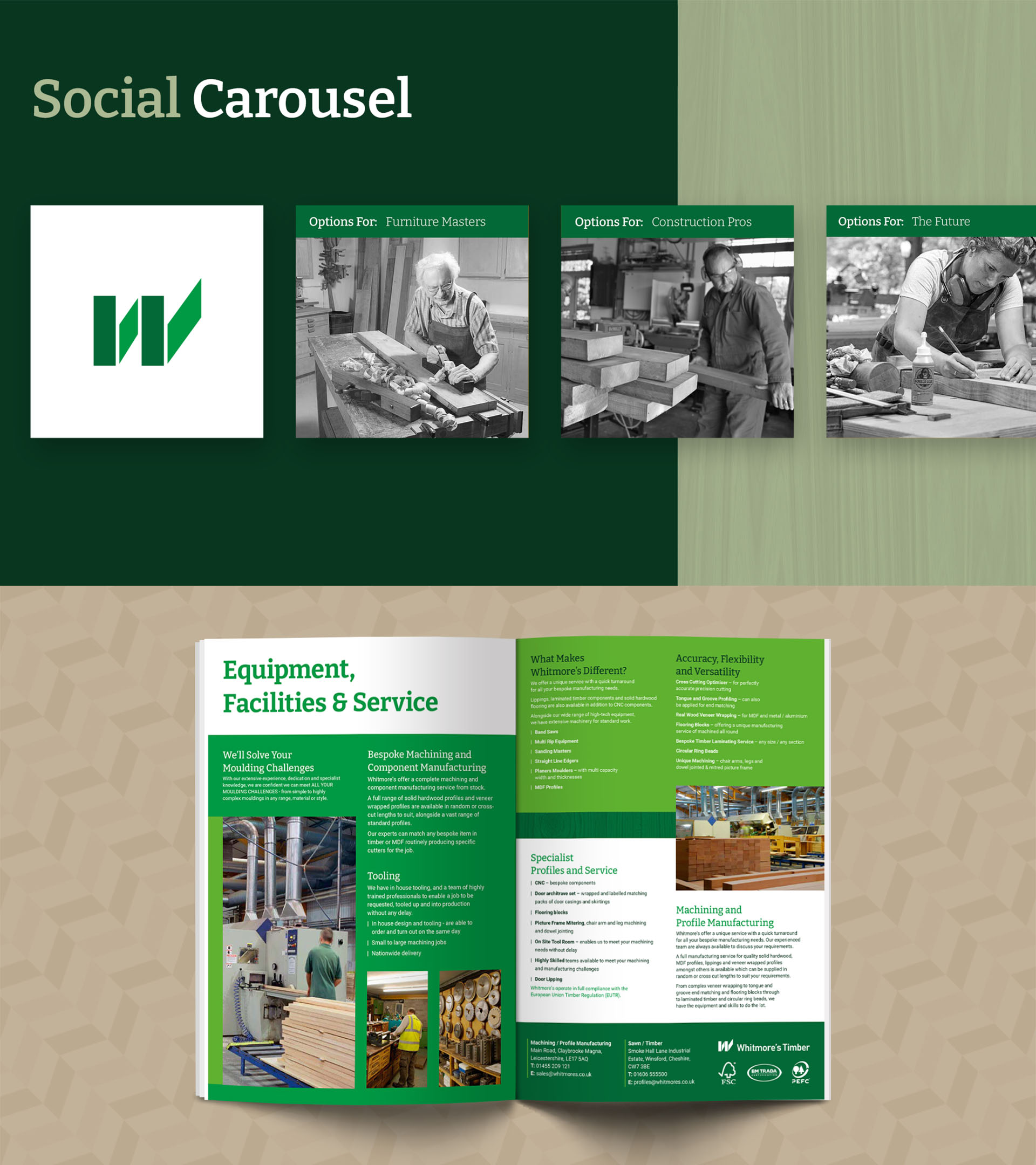
The first thing we did was recreate the logo so it was in a modern format. This included tracking down the original font and fixing any small imperfections. From there we focused on the rest of the visual identity including colours, typography, tone of voice, photography, textures, patterns and more.
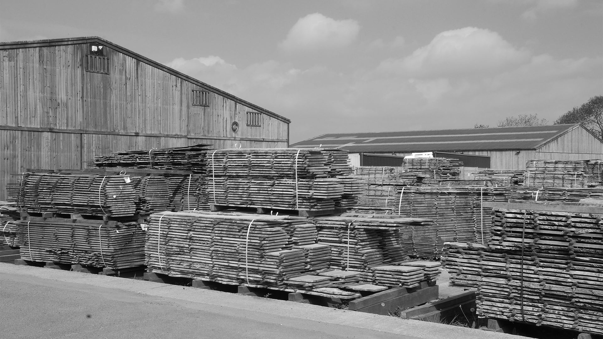
In order to stand out amongst the competition, we had to differentiate in areas other than colour. Green was staying due to it being a core part of their identity for their entire existence. This resulted in us using wooden textures, all of which are unique and could be taken from their actual products, herringbone patterns to represent their product’s use cases, and black and white photography to help highlight their history.
“Options For” was also created as a key phrase for their messaging. It represents their diversity of products and customers, and how they always have “options for” different ages, skill levels, trades, etc.
We delivered comprehensive brand guidelines, alongside justifications and use cases for all elements within it. Plus a myriad of mockups showcasing how their new identity could all fit together.
We believe Whitmore’snew look is far more suited to a younger demographic, offers way more flexibility, and meets all the requirements to flourish in the digital space. The foundations are in place for their future marketing and strategic direction.
| Cookie | Duration | Description |
|---|---|---|
| cookielawinfo-checkbox-advertisement | 1 year | Set by the GDPR Cookie Consent plugin, this cookie is used to record the user consent for the cookies in the "Advertisement" category . |
| cookielawinfo-checkbox-analytics | 11 months | This cookie is set by GDPR Cookie Consent plugin. The cookie is used to store the user consent for the cookies in the category "Analytics". |
| cookielawinfo-checkbox-functional | 11 months | The cookie is set by GDPR cookie consent to record the user consent for the cookies in the category "Functional". |
| cookielawinfo-checkbox-necessary | 11 months | This cookie is set by GDPR Cookie Consent plugin. The cookies is used to store the user consent for the cookies in the category "Necessary". |
| cookielawinfo-checkbox-others | 11 months | This cookie is set by GDPR Cookie Consent plugin. The cookie is used to store the user consent for the cookies in the category "Other. |
| cookielawinfo-checkbox-performance | 11 months | This cookie is set by GDPR Cookie Consent plugin. The cookie is used to store the user consent for the cookies in the category "Performance". |
| CookieLawInfoConsent | 1 year | Records the default button state of the corresponding category & the status of CCPA. It works only in coordination with the primary cookie. |
| elementor | never | This cookie is used by the website's WordPress theme. It allows the website owner to implement or change the website's content in real-time. |
| viewed_cookie_policy | 11 months | The cookie is set by the GDPR Cookie Consent plugin and is used to store whether or not user has consented to the use of cookies. It does not store any personal data. |
| Cookie | Duration | Description |
|---|---|---|
| _ga | 2 years | The _ga cookie, installed by Google Analytics, calculates visitor, session and campaign data and also keeps track of site usage for the site's analytics report. The cookie stores information anonymously and assigns a randomly generated number to recognize unique visitors. |
| _ga_G8DMM0NJHK | 2 years | This cookie is installed by Google Analytics. |
Our free audit offers actionable advice in order to help your business grow. Enquire today, what’s there to lose?