
Path2Lab are biomedical couriers changing the way pharmacies, laboratories and nursing businesses are handling their logistics. Path2Lab pride themselves on their commitment, responsibility and care.
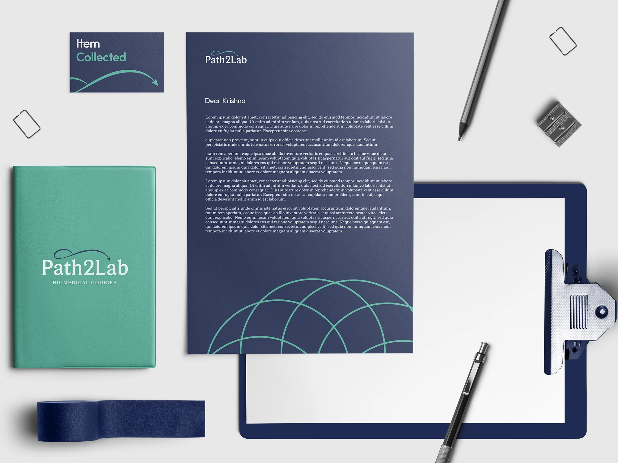
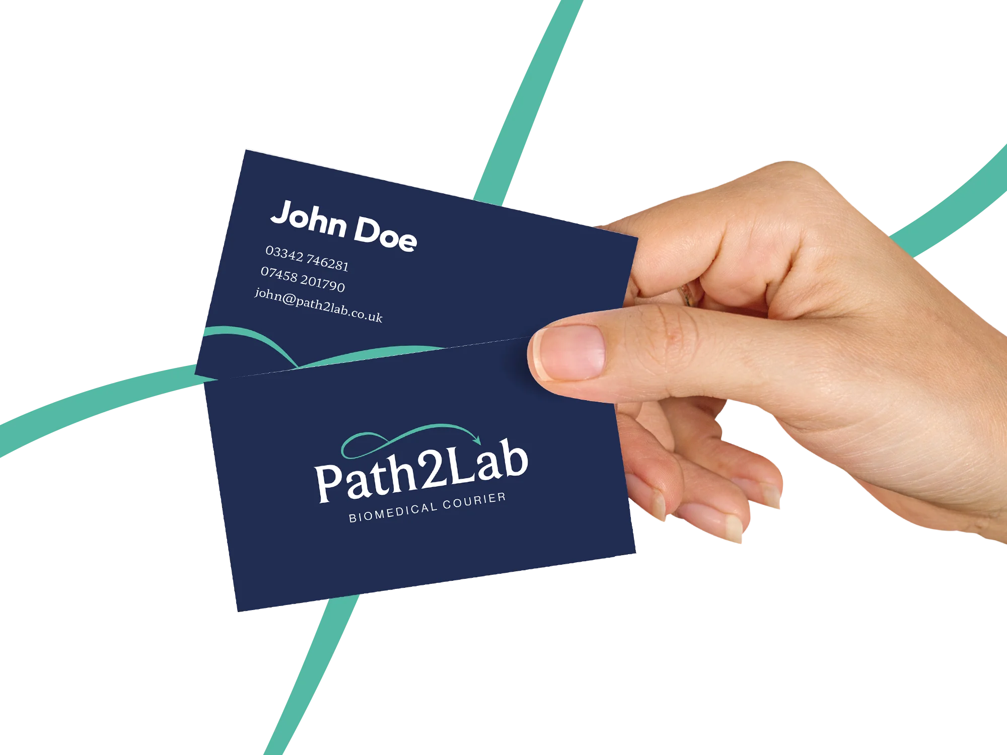
As a newer business, it was vital Path2Lab would be recognisable to the industries they serve. The challenge was doing such, without being overly samey. Due to where the branding would end up, it was also important to include a lot of flexibility within the system, so that everything always felt cohesive. For example, having multiple variations of the logo for various situations
Get in touch to see how design could help your business grow
The first thing we did was research through meetings, questionnaires and moodboards. Collectively this gave us a solid foundation. We knew what Path2Lab wanted to achieve, what potential problems we would face and who the target audience was.
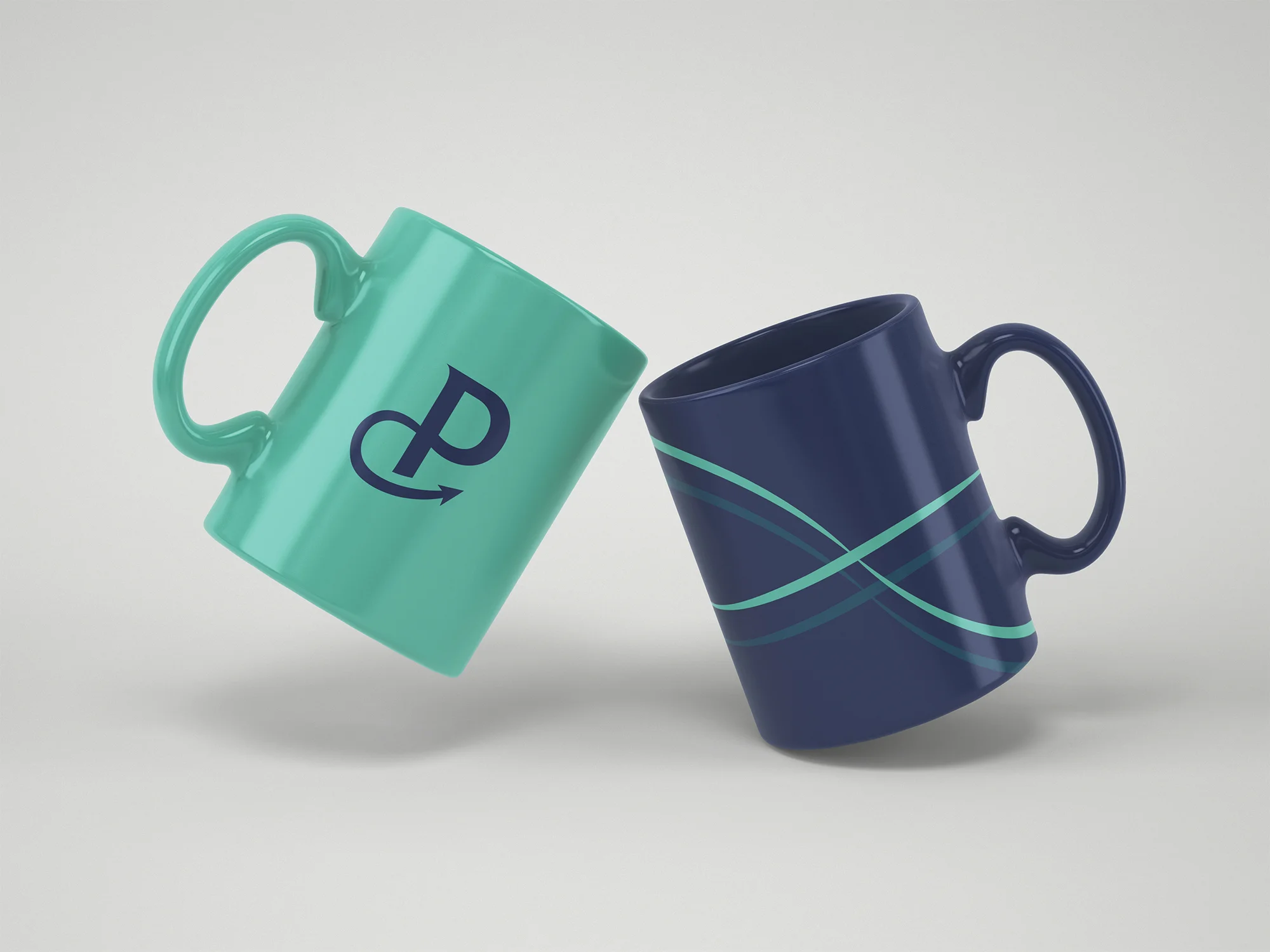
After the research, we went into designing. The logo came first, where we opted for a serif typeface. Unlike most of the industry, we felt this highlighted the extra attention to detail Path2Lab provides and knew it would likely resonate with their audience. Using mint and navy in combination with double helix inspired shapes, we got across the medical mood.
Following the presentation of the brand guidelines, we sent the final versions alongside all the logo files, iconography and applications. Going forward we’re excited to see how the Path2Lab brand will be utilised. Expect to see them in a pharmacy near you!
| Cookie | Duration | Description |
|---|---|---|
| cookielawinfo-checkbox-advertisement | 1 year | Set by the GDPR Cookie Consent plugin, this cookie is used to record the user consent for the cookies in the "Advertisement" category . |
| cookielawinfo-checkbox-analytics | 11 months | This cookie is set by GDPR Cookie Consent plugin. The cookie is used to store the user consent for the cookies in the category "Analytics". |
| cookielawinfo-checkbox-functional | 11 months | The cookie is set by GDPR cookie consent to record the user consent for the cookies in the category "Functional". |
| cookielawinfo-checkbox-necessary | 11 months | This cookie is set by GDPR Cookie Consent plugin. The cookies is used to store the user consent for the cookies in the category "Necessary". |
| cookielawinfo-checkbox-others | 11 months | This cookie is set by GDPR Cookie Consent plugin. The cookie is used to store the user consent for the cookies in the category "Other. |
| cookielawinfo-checkbox-performance | 11 months | This cookie is set by GDPR Cookie Consent plugin. The cookie is used to store the user consent for the cookies in the category "Performance". |
| CookieLawInfoConsent | 1 year | Records the default button state of the corresponding category & the status of CCPA. It works only in coordination with the primary cookie. |
| elementor | never | This cookie is used by the website's WordPress theme. It allows the website owner to implement or change the website's content in real-time. |
| viewed_cookie_policy | 11 months | The cookie is set by the GDPR Cookie Consent plugin and is used to store whether or not user has consented to the use of cookies. It does not store any personal data. |
| Cookie | Duration | Description |
|---|---|---|
| _ga | 2 years | The _ga cookie, installed by Google Analytics, calculates visitor, session and campaign data and also keeps track of site usage for the site's analytics report. The cookie stores information anonymously and assigns a randomly generated number to recognize unique visitors. |
| _ga_G8DMM0NJHK | 2 years | This cookie is installed by Google Analytics. |
Our free audit offers actionable advice in order to help your business grow. Enquire today, what’s there to lose?