
CRS Matrix is the parent brand of CRS Gas, CRS Electrical and CRS Energy. They provide exceptional customer service for anything gas, electrical or energy for homeowners, landlords, estate agents, businesses, etc.
After an initial questionnaire and meeting, we were tasked with creating a brand identity and brand guidelines for CRS Matrix (including sub-brands), focusing on unifying and better aligning their offerings. This work was to act as the foundation for marketing material going forward. Based on our conversations and research, we knew CRS could reposition slightly to be perceived as more modern and for their visuals to better represent their approach in other areas of their business.
Get in touch to see how design could help your business grow
Before starting anything creative, we did some research into CRS’ target audience, competition and their existing branding. Owing to this, we proposed two ideas: “Refreshing Unity” and “Quality Convenience”. Each with the goal of unifying their offerings, just in slightly different ways.
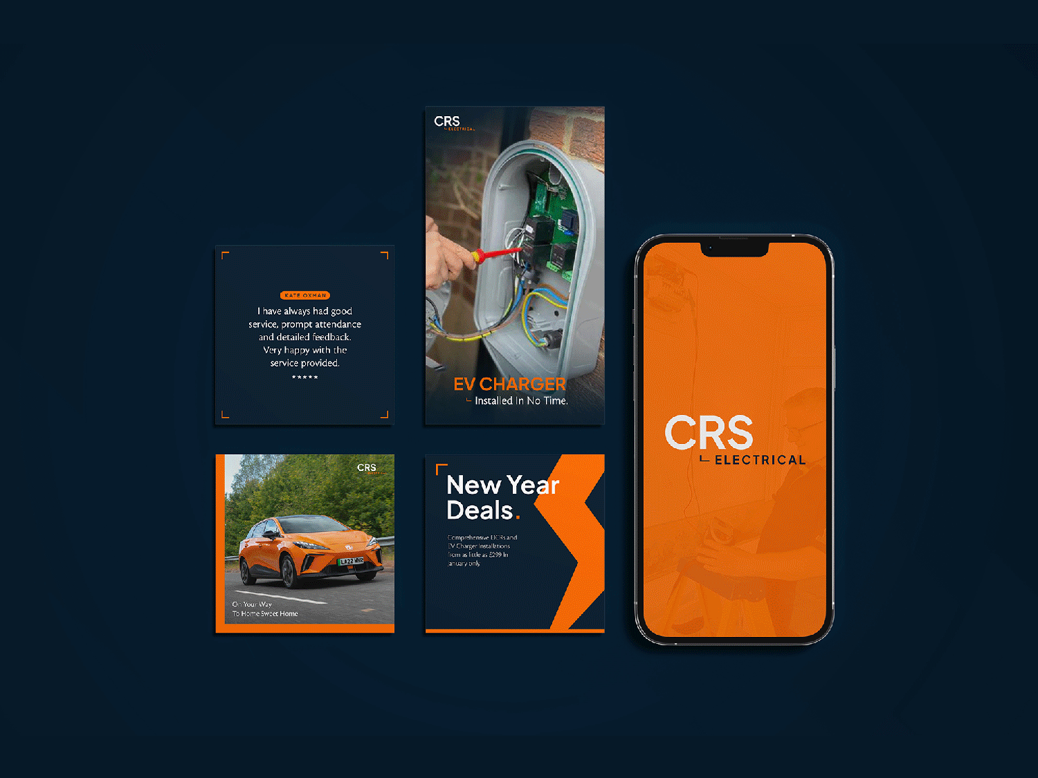
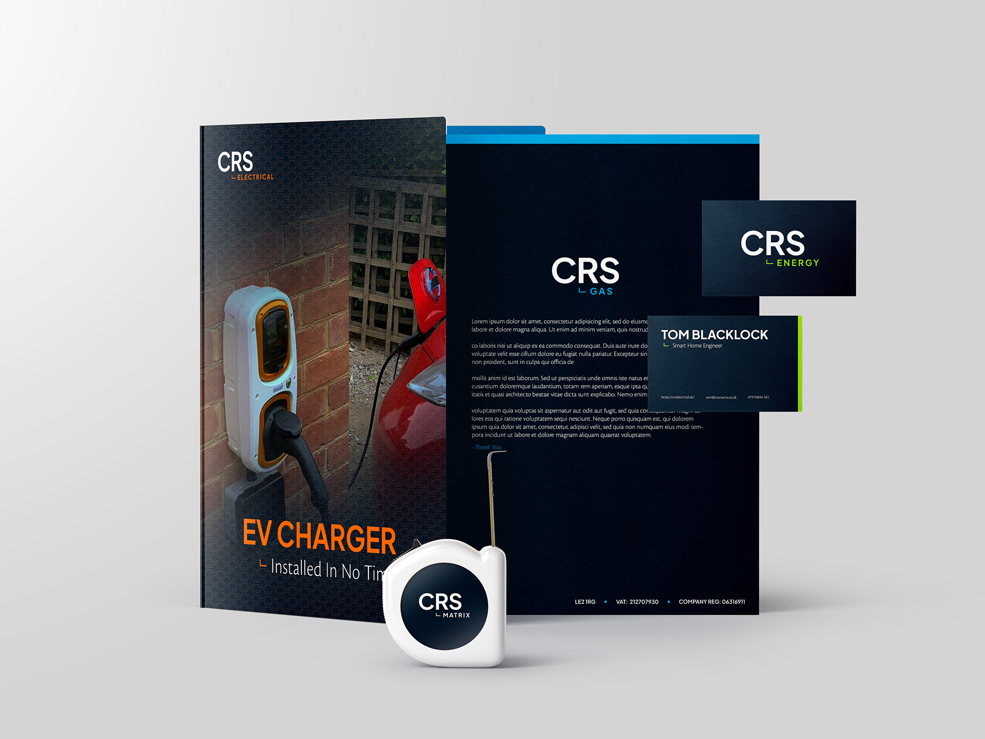
Once we knew which direction to go in, we started the creative work. Overall the aim was for simplification, with each sub-brand feeling like they belonged to the same group. We also wanted to keep some elements of the old branding, to not completely alienate anyone familiar with it already. As a result, we kept the bold CRS in all logos as the dominant element.
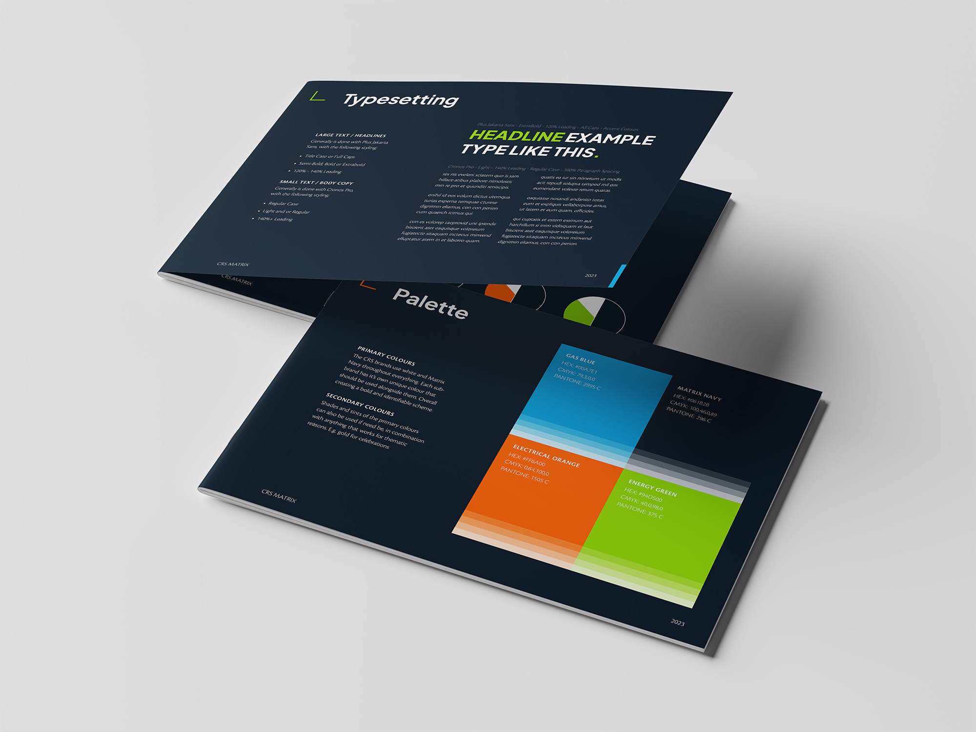
After we presented the branding, we shared full guidelines as an interactive PDF, plus a bunch of mockups of how the brand could look. The majority of colours, logos, fonts, etc were given in an Adobe Creative Cloud Library so they were free to start creating.
| Cookie | Duration | Description |
|---|---|---|
| cookielawinfo-checkbox-advertisement | 1 year | Set by the GDPR Cookie Consent plugin, this cookie is used to record the user consent for the cookies in the "Advertisement" category . |
| cookielawinfo-checkbox-analytics | 11 months | This cookie is set by GDPR Cookie Consent plugin. The cookie is used to store the user consent for the cookies in the category "Analytics". |
| cookielawinfo-checkbox-functional | 11 months | The cookie is set by GDPR cookie consent to record the user consent for the cookies in the category "Functional". |
| cookielawinfo-checkbox-necessary | 11 months | This cookie is set by GDPR Cookie Consent plugin. The cookies is used to store the user consent for the cookies in the category "Necessary". |
| cookielawinfo-checkbox-others | 11 months | This cookie is set by GDPR Cookie Consent plugin. The cookie is used to store the user consent for the cookies in the category "Other. |
| cookielawinfo-checkbox-performance | 11 months | This cookie is set by GDPR Cookie Consent plugin. The cookie is used to store the user consent for the cookies in the category "Performance". |
| CookieLawInfoConsent | 1 year | Records the default button state of the corresponding category & the status of CCPA. It works only in coordination with the primary cookie. |
| elementor | never | This cookie is used by the website's WordPress theme. It allows the website owner to implement or change the website's content in real-time. |
| viewed_cookie_policy | 11 months | The cookie is set by the GDPR Cookie Consent plugin and is used to store whether or not user has consented to the use of cookies. It does not store any personal data. |
| Cookie | Duration | Description |
|---|---|---|
| _ga | 2 years | The _ga cookie, installed by Google Analytics, calculates visitor, session and campaign data and also keeps track of site usage for the site's analytics report. The cookie stores information anonymously and assigns a randomly generated number to recognize unique visitors. |
| _ga_G8DMM0NJHK | 2 years | This cookie is installed by Google Analytics. |
Our free audit offers actionable advice in order to help your business grow. Enquire today, what’s there to lose?