In the era of 10 second instagram reels, people never have the patience to read lengthy paragraphs of text. This is where the power of visuals and data visualisations comes into play.
By incorporating compelling visuals and data visualisations, web pages can effectively communicate information in a concise and engaging manner.
In this blog post, we will explore the strategies and techniques for leveraging visuals and data visualisations to enhance information communication on web pages.
What is Data Visualisation?

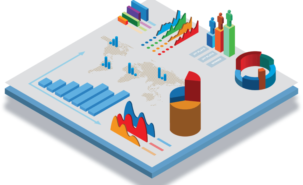
Data visualisation is the representation of data and information in visual formats such as charts, graphs, maps, and infographics. It is a way to present complex data sets and information in a visually appealing and easily understandable manner.
Data visualisation allows users to quickly grasp patterns, trends, and relationships that may not be apparent in raw data alone. By transforming data into visual elements, such as shapes, colours, and sizes, data visualisations enable users to make better-informed decisions, gain insights, and communicate information effectively.
Why are Visuals Important?
Visuals play a crucial role in information communication as they aid comprehension, improve memory retention, and evoke emotional responses. Similarly, data visualisations are persuasive tools that simplify complex information, enhance credibility, and support arguments.
Visuals have a significant impact on how information is processed and understood. They help break down complex concepts into digestible chunks, making it easier for users to comprehend and retain information. Visuals also appeal to emotions, generate interest, and increase the likelihood of user engagement.
Data Visualisations as Persuasive Tools
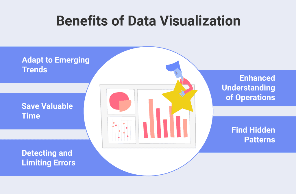
Data visualisations are particularly effective in conveying complex information. They present data in a visually appealing format, allowing users to quickly identify patterns, trends, and relationships. This simplification of data enhances comprehension and enables users to draw insights and make informed decisions.
Additionally, data visualisations lend credibility to the information presented, as they provide a factual basis for arguments and support the narrative.
Choosing the Right Visuals and Data Visualisations
There will be too much data for you to use. To effectively communicate information on web pages, it is essential to select visuals and data visualisations that align with the content goals and target audience preferences. Presenting them in the best way possible is equally important too. The following steps will be highly beneficial:
Align Visuals with Content Goals
Before incorporating visuals, identify the main message and purpose of the web page. Consider what information needs to be emphasised or highlighted. This will help determine the type of visuals that will best support the content and achieve the desired communication goals.
Select Appropriate Visual Formats
Different types of visual formats are suitable for conveying different types of information. For simple concepts and comparisons, static visuals such as images and infographics work well. Interactive visualisations, such as charts and graphs, are ideal for presenting complex data analysis and allowing users to explore the data themselves.
Maintain a Visually Balanced Layout
Avoid cluttered designs by using white space effectively. White space helps reduce visual noise and improves readability. Ensure that visuals are appropriately sized and placed, maintaining a harmonious balance between text and visual elements.
Optimise for Responsive Design
With the increasing use of mobile devices, it is crucial to ensure that visuals and data visualisations adapt well to different screen sizes and orientations. Responsive design ensures that the visuals remain clear, legible, and visually appealing across various devices.
Consider accessibility by providing alternative text for screen readers and other assistive technologies. Alternative text should provide a concise and meaningful description of the visual content, allowing visually impaired users to access the information.

Design Principles for Visuals and Data Visualisations
Effective visual design is key to enhancing information communication on web pages. Several design principles can guide the creation of visually appealing and meaningful visuals and data visualisations.
Simplicity and Clarity
Avoid unnecessary complexity and excessive details that can overwhelm users. Keep visuals and data visualisations simple and focused on the main message. Use clear labels, annotations, and legends to guide users’ understanding and interpretation of the visuals.
Consistency and Coherence
Maintain a consistent visual style throughout the web page to create a cohesive user experience. Consistency in colour schemes, typography, and overall design elements helps users navigate and understand the information more easily. Ensure that visual elements align with the overall brand identity for a unified and professional look.
Colour and Visual Hierarchy
Strategically use colour to convey meaning and highlight key points in visuals and data visualisations. Choose a colour palette that is visually appealing and supports the intended message. Establish a clear visual hierarchy by using colour, size, and placement to guide users’ attention and emphasise important information.
Using Visuals and Data Visualisations Seamlessly
To maximise the impact of visuals and data visualisations, they should be seamlessly integrated into the content flow, providing context, supporting evidence, and additional insights.
Embed Visuals Within the Content Flow
Introduce visuals with relevant context and explanations. Clearly articulate the purpose of the visual and how it relates to the surrounding text. Use visuals as supporting evidence or examples to enhance the understanding and credibility of the information presented.
Provide Interactive Elements and Annotations
For complex data visualisations, consider providing interactive elements such as zooming, panning, and filtering options. These features allow users to explore and interact with the data, gaining deeper insights and personalising their experience. Include tooltips and captions to offer additional information and clarify any potential ambiguity in the visuals.
Compress Image Files for Faster Loading Times
Use appropriate file formats (JPEG, PNG, SVG) based on the visual type and its characteristics. Compress image files to reduce their size without compromising quality. Optimising image files significantly improves loading speed, especially for users on slower internet connections.
Leverage Caching and Content Delivery Networks (CDNs)
Implement browser caching to store visual assets locally on users’ devices. Caching allows subsequent visits to the web page to load faster by retrieving assets from the local cache. Additionally, utilise content delivery networks (CDNs) to deliver visuals from servers geographically closer to the user, reducing latency and improving overall performance.
Conclusion
Incorporating visuals and data visualisations effectively on web pages can significantly improve information communication, engage users, and enhance comprehension.
By understanding the importance of visuals, selecting appropriate formats, adhering to design principles, and optimising for usability and performance, web designers and content creators can create compelling and informative web pages that leave a lasting impact on their audience.
By harnessing the power of visuals, you can elevate your web pages and effectively communicate your message to a wide range of users.


