Mastercard is known for its iconic red and yellow logo. But in a world where technology is constantly evolving, Mastercard realised that it needed to update its branding strategy in order to stay relevant.
In 2018, Mastercard unveiled a new brand identity, which aimed to make the company appear more modern and cutting-edge. Within the new brand identity, for instance, the new logo was designed with simplicity in mind, and it features just two intersecting circles, instead of combining the circles with ‘Mastercard’ written underneath. And now, 5 years later, with a couple more additions to the overall branding strategy, we are seeing the impact of the changes applied by Mastercard.
In this feature, we look through the transition of Mastercard over the years, and how the company has reinvented itself in recent times by aligning itself with more digital finance options.
The Origin Story of Mastercard
Mastercard started in the late 1940s when various U.S. banks gave their customers special paper that could be used like cash at different stores.
In the next decade, a few different franchises developed in which a bank, usually located in a large city, would agree to accept cards as payment from specific merchants they had chosen to partner with. In 1966, one of these bank partners formed the Interbank Card Association (ICA), later changing its name to Mastercard.
Mastercard was the first network to allow member banks to issue their own Mastercard-branded cards. Mastercard also played a role in revolutionising the world of online transactions in 1991 by launching the first-ever point-of-sale debit network.
Mastercard’s Branding Strategy
Mastercard has undergone a major branding transformation in recent years, aligning itself with more modern and digital finance options.
“Priceless” Advertising Campaign
In 1997, Mastercard launched its “Priceless” advertising campaign, which featured a series of emotional commercials that were meant to connect with consumers on a personal level. The campaign was a success and helped to solidify Mastercard’s position as a brand that understood the needs and desires of its customers.
New Tagline
“Priceless” campaign was also launched with a new tagline, “There are some things money can’t buy. For everything else, there’s Mastercard.” The updated tagline was designed to reflect the changing needs of consumers and the evolving role of Mastercard as a brand.
Mastercard Brand Statement Launch
By 2015, Mastercard had debuted its first-ever brand purpose statement to get in line with the changing market, “Connecting people to priceless possibilities.” The purpose statement was designed to capture the brand’s essence and communicate its role in the lives of consumers.
“Start Something Priceless” Campaign
In 2018, Mastercard launched its “Start Something Priceless” campaign, which featured a series of ads that showcased the positive impact that Mastercard-enabled businesses and charities have on the world. The campaign was designed to inspire consumers to use Mastercard to make a difference in the world.
It is also important to note that Mastercard’s branding strategy extends beyond just its advertising campaigns. Mastercard’s website, social media channels, and even its physical credit cards all feature the same modern and simplified branding. This helps Mastercard to create a consistent and recognizable brand identity that consumers can easily connect with.
Core Branding Principles
Mastercard’s branding is defined by three core principles: simplicity, balance, and contrast.
- Simplicity: Mastercard’s brand identity is based on a simple and modern design. The brand’s logo is a perfect example of this principle in action. The logo is a simple red and yellow circle with the Mastercard symbol in the centre. The simplicity of the logo makes it instantly recognizable and easy to remember.
- Balance: Mastercard’s branding is carefully balanced between being modern and approachable. The brand’s ads often feature a mix of professional models and “real people.” This helps create a sense of balance that makes the ads more relatable. Mastercard’s website is also carefully balanced between being informative and visually appealing.
- Contrast: Mastercard’s branding makes use of contrast to create visual interest. The brand often uses bright, saturated colours in its visuals. This helps create a sense of vibrancy and energy that really grabs attention. Mastercard also often uses blue in its visuals. Blue is a calming colour that provides a stark contrast to the brand’s more energetic visuals.
Mastercard Logos Over the Years
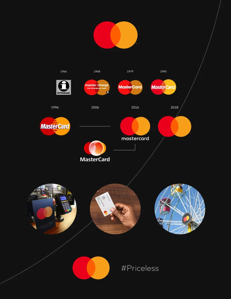
Perhaps the most recognisable part of Mastercard’s branding, the logo of Mastercard has gone through multiple changes throughout the history of the company. Here’s a quick look at the said changes:
Mastercard’s First Two Logos
Mastercard’s original logo, launched in 1966, was simply a white coloured ‘i’ with a black overlay and grey background, completed with ‘interlink’ written underneath.
Then, in 1968, Mastercard (Interlink at the time), changed its name to ‘Master Charge’ and introduced a new logo.
Designed by Michael Beirut, the logo consisted of two interlocking circles. The outer circle represented the world of commerce, while the inner circle symbolised Mastercard’s role in connecting people and businesses.
Mastercard’s Third Logo
In 1979, Mastercard updated its logo for the first time in nearly 20 years. The new logo was a yellow and red Mastercard symbol. The company said that the new logo was designed to be “modern and forward-looking.”
Mastercard’s Fourth & Fifth Logos
In 1990, Mastercard unveiled a new look for its logo. The update was relatively minor, as the company kept the same red and yellow Mastercard symbol, but added a blue background. Mastercard said that the blue background was meant to represent “the world of possibilities that Mastercard enables.” The fifth iteration of the Mastercard logo, launched in 1996, simply made the design bolder, highlighting the word ‘MasterCard’.
Mastercard’s Sixth Logo
In 2006, Mastercard made another slight update to its logo, moving the term ‘MasterCard’ underneath the updated design, and adding a lense in between the iconic two circles.
Mastercard’s Seventh Logo
In March 2016, Mastercard made another update to its logo, this time making the Mastercard wordmark lowercase. Mastercard said that the lowercase letters were meant to represent “the company’s commitment to simplifying payments.”
Mastercard’s Eight Logo
As of 2019, Mastercard has completely removed the term ‘Mastercard’ from its logo, citing that most of the market already recognises the two circles, and hence, they don’t need to include the term in the new design. This change also allowed Mastercard to slightly enhance the connecting circles, making them the lone standing focal point of their visual identity.
You can check all the Mastercard logos and the background work that went into them, here.
Multisensory Branding in a Digital Era
In the digital era, Mastercard is focusing on multisensory branding to stand out from its competitors.
Mastercard’s sonic brand identity is one example of this strategy. In 2020, Mastercard debuted its first-ever Mastercard “soundmark.” The soundmark is a short musical sting that features the Mastercard symbol.
Process of Choosing Imagery for Each Campaign
Mastercard’s advertising campaigns typically feature a mix of lifestyle and product shots. For its “Priceless” campaign, Mastercard commissioned a series of ads that featured emotional stories about people’s lives. In its “Start Something Priceless” campaign, Mastercard partnered with a number of businesses and charities to showcase the positive impact that Mastercard-enabled businesses and charities have on the world.
In the visuals used by Mastercard, the key to effective photography is a human, natural and aspirational tone. They accomplish this by ensuring that the photos are highly saturated, authentic and feature bright, vibrant colours. In addition, the imagery used by Mastercard captures people in their natural environment doing something they would normally do. This allows Mastercard to show that their brand is relatable and down-to-earth.
From a composition perspective, Mastercard’s visuals tend to favour a horizontal orientation. This allows them to show multiple people or different aspects of the same scene. They also often use closeups and mid-shots to further engage viewers. In terms of framing, Mastercard’s visuals are typically well-balanced with plenty of negative space. This gives the viewer a sense of calm and allows them to focus on the people and emotions in the scene.
In terms of Mastercard’s choice of models, they tend to use a mix of professional models and “real people.” This helps further the brand’s down-to-earth image and makes their ads more relatable. Mastercard also uses a mix of male and female models, as well as people of different ages, to further appeal to a wide range of consumers.
Mastercard’s use of colour is also noteworthy. The brand typically uses bright, saturated colours in its visuals. This helps create an emotional response in viewers and makes the ads more visually appealing. Mastercard also often uses blue in its visuals. Blue is a calming colour that is associated with trust, which is important for a brand like Mastercard.
You can check the full Mastercard Media Library, here.
Mastercard’s Partnerships with Digital Banks
In recent years, Mastercard has partnered with a number of digital banks. This is in line with Mastercard’s strategy of partnering with emerging companies in the payments space. The partnerships have helped Mastercard to extend its reach into new markets and tap into the growing trend of consumers using digital banking services.
Some of Mastercard’s most notable digital bank partnerships include:
- N26: Mastercard partnered with N26 in 2017. N26 is a German digital bank that offers Mastercard debit cards to its customers. The partnership has helped Mastercard to extend its reach into the European market.
- TransferWise: Mastercard partnered with TransferWise in 2018. TransferWise is a UK-based digital bank that offers Mastercard debit cards to its customers. The partnership has helped Mastercard to extend its reach into the British market.
Mastercard’s partnerships with digital banks have helped the brand to tap into the growing trend of consumers using digital banking services. The partnerships have also helped Mastercard to extend its reach into new markets. Mastercard’s strategy of partnering with emerging companies in the payments space is a smart one that is likely to pay off in the long run.
Mastercard and Cryptocurrency Trading
Mastercard has also partnered with a number of cryptocurrency trading platforms. The partnerships have helped Mastercard to tap into the growing trend of consumers using cryptocurrencies. The partnerships have also helped Mastercard to extend its reach into new markets.
Two of the most recent Mastercard’s most notable cryptocurrency trading platform partnerships include:
- CEX.IO: Mastercard partnered with CEX.IO in 2021. CEX.IO is a UK-based cryptocurrency trading platform that offers Mastercard debit cards to its customers. The partnership has helped Mastercard to extend its reach into the British market.
- Coinbase: Mastercard partnered with Coinbase in 2022 to ease the commerce surrounding NFTs. Coinbase is a US-based cryptocurrency trading platform that offers Mastercard debit cards to its customers. The partnership has helped Mastercard to extend its reach into the American market.
Mastercard is also bringing the ability to trade cryptocurrencies to banks. Mastercard has partnered with a number of banks to pilot the program. The partnerships have helped Mastercard to extend its reach into new markets. These partnerships include:
- Technology and partnership support that allows you to buy, hold, or sell chosen cryptocurrency assets.
- A variety of security management solutions, including identity solutions, crypto analytics, transaction monitoring, anti-money laundering capabilities, and cybersecurity.
- Products that enable people to spend and cash out their cryptocurrency, including crypto cards, open banking, and cross border services. With Mastercard’s technology, financial institutions would also be able to offer additional functionality like digital receipts and loyalty solutions.
- End-to-end support for banks, fintechs and issuers who want to offer crypto programs at scale. This includes program design, product development and technology implementation, as well as go-to-market optimization and marketing consultancy services.
Suggested Improvements for Mastercard
There isn’t anything serious to fault in the branding of Mastercard. However, as always, there are areas within campaigns development that can benefit from an extended look.
For instance, Mastercard could improve its branding by:
- Focusing on its purpose statement, “We work to connect and power an inclusive digital economy that benefits everyone, everywhere.” Mastercard could create campaigns and ads that showcase how its products and services are helping to connect people and power the digital economy.
- Continuing to expand its partnerships with businesses and charities that are making a positive impact on the world. Mastercard could create campaigns that highlight the work of its partners and show how consumers can use Mastercard to make a difference.
- Developing new products and services that meet the changing needs of consumers. Mastercard could create campaigns that showcase how its products and services are helping people to live their best lives.
Closing Remarks
Mastercard has done an excellent job at branding itself as a modern and forward-thinking company. Mastercard’s advertising campaigns have been effective in connecting with consumers on an emotional level and showcasing the company’s commitment to meeting the needs of its customers. Mastercard’s purpose statement is also strong and communicates the brand’s role in the lives of consumers. Overall, Mastercard is well-positioned to continue its success in the future.

